Monday, December 31, 2012

Motifs and Repainting

Happy new year! Tonight I'm going to talk about motifs and revisiting them. Also, technique and it's progression in the attainment of an artists personal vision. 

Starting in 2010 I went far more tonal and indirect in my approach to oil painting. I was inspired by a trip I took with my wife to the De Young Museum. At the end of the American collection they had several large rooms dedicated to American landscape painting. 

I was especially intrigued by the work of George Inness but also Thomas Moran and Frederic Edwin Church. I loved the surfaces of these paintings and their soft glowing inner light. 

November Light (6x9) by M Francis McCarthy

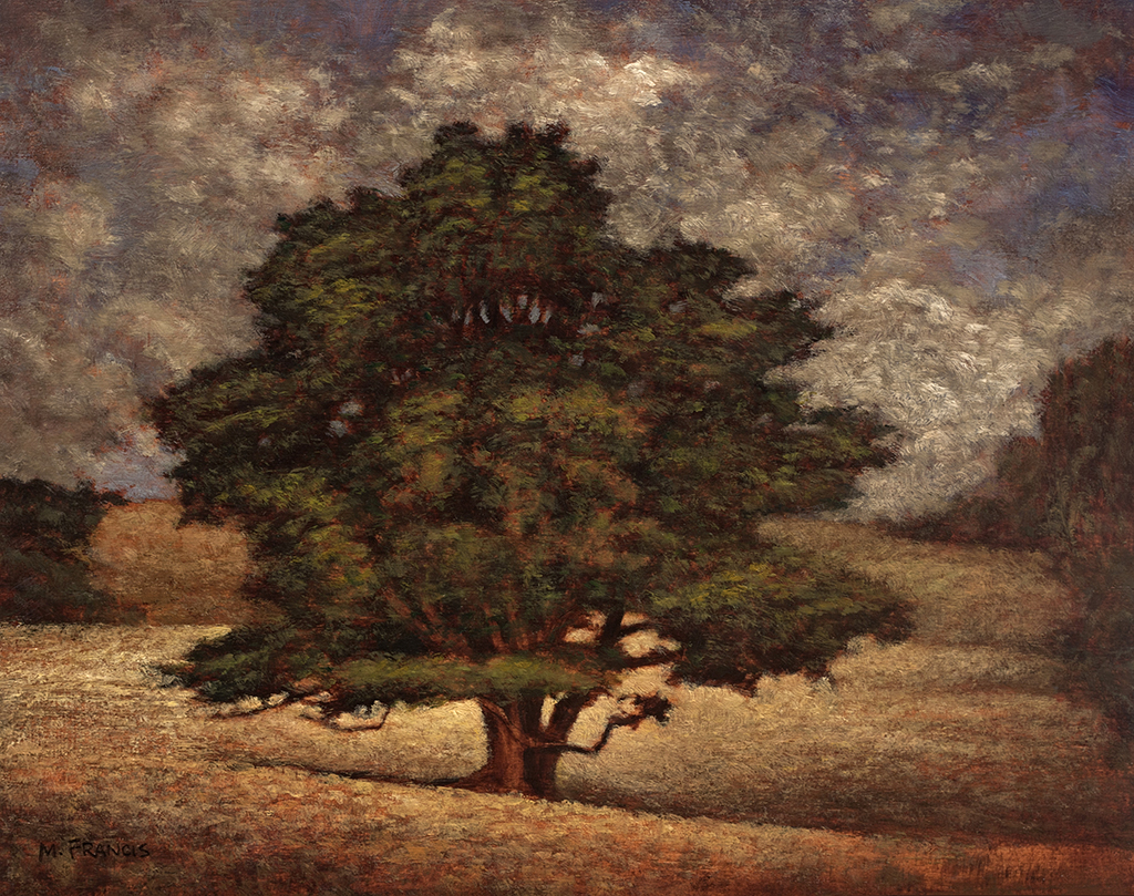
This version of November Light was painted in July of 2010 and currently resides in the collection of a fan of my work. It was painted on a maple panel that I'd brought over from the states.

At that time I was painting only small pieces but putting full intention and finish into them. the inspiration for this painting came from my first trip to New Zealand in 2009 and it was one of the first I painted after moving here in 2010.

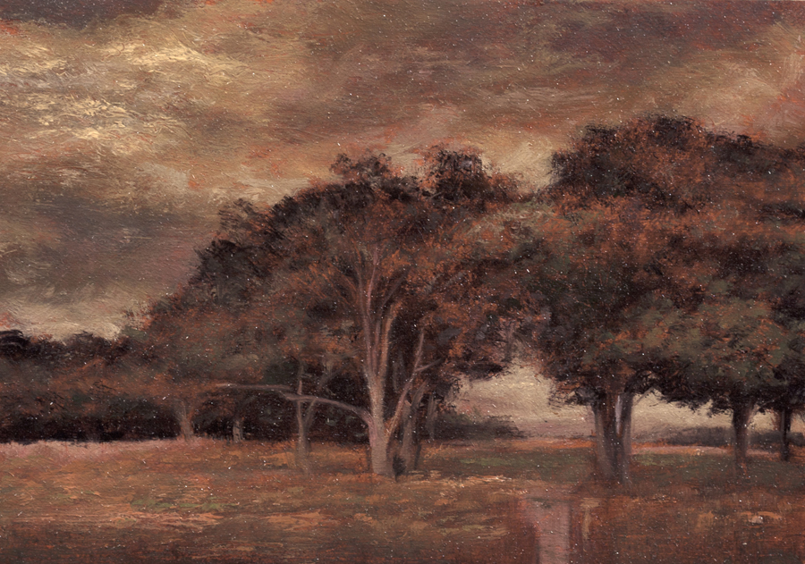
I really like this composition and how it features water and an interesting tree but I felt the sky was lacking movement and drama.

At the time I was fascinated with proportion and was only painting in 6x9. The 6x9 format's 3:2 aspect ratio is the most similar to the golden ratio. Proprortion is a topic that I'd like to get into further in a later post.


November Light (5x5 by M Francis McCarthy

This is my 5x5 reworking of November Light, painted in 2011. After painting a series of Four 8x8 paintings that were for a show at Hangar Gallery, I was becoming interested in the square format and decided that I'd like to repaint November Light as a 12x12.

It was at this time that I first started doing small oil studies prior to executing the larger pieces. I quite enjoy doing the small paintings and a nice side benefit is that it creates an affordable small painting for people that collect my work.


November Light (12x12)by M Francis McCarthy

Here is the finished painting as a 12x12. It feels different from either of the other two paintings and I'm quite happy with the result. What I like best about this piece is the expressive sky and brush technique that does the job with out being too finicky. 

I aspire to create each painting using as few brush strokes and successive layers as possible. That said, I'll keep painting until I get the scene across. I pick, jab, scratch and layer brush strokes, anything I have to do.


Sunday, December 30, 2012

Animal Illustration

As an Illustrator working for Jack Nightingale Artworks I was called upon to execute many different styles for projects. A big account was San Diego Zoo. BTW all the illustrations in this post are copyrighted by Jack Nightingale Artworks. I just drew them and got paid. I show them here on my blog for purposes of review and education only.

Indian Elephant by M Francis McCarthy

The style for this guy was taken from a image I saw of a elephant on the web. I simplified the color scheme and drew an Indian elephant in a quick line and shaded in Photoshop. What I liked about this illio was how it looked good on any color. Never got bought but looks like a winner to me still.

In my Early days at Jack Nightingale Artworks I had lots of time to really detail my illustrations but as each successive year passed less and less time was available. I feel that this was true for any art department in the early to mid 2000's. 

You can still get great results in less time if you keep your eye on the prize and have the right attitude. I know from first hand experience that spending hours on a piece of artwork will not guarantee a great work of art.


Indian Elephant by M Francis McCarthy

Ok, the Zoo was going to have a special Indian elephant exhibit and they needed a good image for a design. This image was definitely in consideration but not selected for the final design. Pity cause I really like the effect I got on this gal. This is a strong combination of photo shop and hand drawing. One day I would love to teach a class in this type of illustration.


Wolf by M Francis McCarthy


I've seen this wolf illustrated by others, the reference is available online. This is a pretty detailed brush and pen drawing that's been scanned into Photoshop and then colored. I always tried get a certain look in the eyes of the animals I illustrated and I really enjoyed the work for many years.

Saturday, December 29, 2012

The Illustrator - Reference

Change up from Landscape painting today. We're going to revisit my early years as a hired gun illustrator. I've always enjoyed the phrase "hired gun" I must admit. 

As an illustrator, I was hired to solve problems and make my employer look good. These images were created back in 98'. All of them have a screen print ready graphic look that I was into.

Mr Spock by M Francis McCarthy

Just for the record "Mr Spock" is copyrighted by whomever owns his likeness. I did this as a portfolio piece never intending to sell the image. It was a real challenge to get the facial shadow right. I like my coloration and over all I was pretty happy with this illustration

Mr Meany by M Francis McCarthy

I'm gonna call my place of employment "Jack Nightingale Artworks". A small art studio with Jack as chief designer and myself art directing. I also did many of the illustrations that we're used in our designs. For me it was a dream job and I was very happy working there for quite a few years. More on that phase of my art journey in future posts

Mr Meanie is another portfolio piece. I did a lot of animals for Jack Nightingale Artworks so I thought I'd do an owl. Up to that point I'd mostly concentrated on figurative art or abstract digital art. Animals however sold well on tee shirts and so I illustrated many, many animals.

Bear Friendly by M Francis McCarthy

I'm proud of this illustration. Grizzly bears are fun to draw and this one owes a lot to the reference I found somewhere. All illustration relies on good reference. Don't let anyone tell you different. Back in those days we found reference at the library or in magazines. 

Most illustrators had something called a morgue with all of their collected clippings. Reference was hard to come by in the pre Google image search era. Now you can find most anything with a few clicks but an illustrator should always be careful about using photography as reference without the permission of the photographer. Many artists can and do get sued. 

These days I only work from my own reference and if possible I'd advise other artists to do the same. If it's not possible to get the shot you need be sure to contact the photographer. Just do it. Many will let you use things as reference for cheap or even free.


Friday, December 28, 2012

Landscape Painting - Color

More ruminations on landscape painting today, with a focus on color. I use a somewhat limited pallet as follows: Black, Cobalt Blue, Phthalo Blue, Dioxazine Purple, Viridian, Alizarin Crimson, Burnt Sienna, Transparent Earth Yellow, Yellow OcherLemon Yellow (hue) and Lead White. I've also recently added Titanium White back into my Lead White for added body. I've arrived at this pallet through years of trying out different colors.

Pastureland (11x14) by M Francis McCarthy

It's important to limit your pallet as much as possible, doing so creates better harmony in the painting. Some of the colors on my pallet are special effect colors like the Violet and the Phthalo Blue. I can get by without these easily.

Others like Ivory Black are for knocking brightness off of a straight mix. Also black is great for making a warm rich green when mixed with yellow. When it comes to using black I almost never use it in an opaque manner. You must be careful with black as too much has a deadening effect. Also, it can be cool in an unforgiving way. I love black and would not want to be without it.

I work on a color principle of warm vs cool colors on my pallet. In the reds Alizarin Crimson is a cool red while I use Burnt Sienna as a warm red. I prefer sienna to any cad reds as I like it's earthy quality. It is made with clay and one of the ancient pigments. 

In the Blues: Cobalt is a warm blue and Phthalo Blue is cool. For the yellows: Yellow Ocher is warm and earthy while Lemon Yellow is cool and quite "green". Viridian I use mostly mixed with Alizarin to create my shadow/dark colors. I use it to modify greens and cut reds as well. As a green it is not really in most landscapes but it is vital as a modifier.

Pastureland (5x7) by M Francis McCarthy

The lead white vs titanium debate is well known to any serious student of oil painting. I love lead white but I must import it to use in my paintings here in New Zealand as it's not freely available here. 

Lead white is far more transparent than Titanium and warmer as well. I use lead white exclusively except for when I teach. Recently though I'm mixing a bit of Titanium in with my Lead white. This is helps to lighten my paintings a bit. Also, it is a very permanent and light-fast color so contributes to their longevity.


Pastureland (sketch) by M Francis McCarthy

The painting I featured today is called Pastureland. a very simple composition but pleasing in it's effect I think. Phthalo Blue features prominently in the sky here and I enjoyed pushing the color pretty far.


Thursday, December 27, 2012

Landscape Painting - Idea

This blog is going to be the first in a random assemblage of posts that I'm calling Landscape Painting. I intend to show the progression of a piece and ramble a bit about the painting or some aspect of the painting or landscape painting in general.

Morning Hillside (8x8) by M Francis McCarthy
First off this painting is currently on display at Helena Bay Galley a beautiful gallery in a beautiful spot. The scene is very Northland New Zealand. That said it could also be anywhere, at least I try to imbue that quality into my work.

I am often asked in my studio at the Quarry Arts Center where a scene is. What place, country or region am I depicting? I often reply that the scene is imagined. As this is true to a large degree, though there may indeed be a specific place that inspired the painting.  

I am not trying to be coy. The real truth is that I have created a Painting and though I may have used photos or drawings done from a site I feel no obligation and have no desire to depict an actual place. The photos and drawings are a prelude to the point of the painting which IS the Painting not the scene itself or the process that birthed it.


Morning Hillside  (5x7) by M Francis McCarthy

That said I will sometimes say "Oh yeah, that's over there on Choctaw ridge" or something to that effect. Because to say all I have to say about that simple query will exhaust the patience of a causal apprehender.
  
What I'm more interested in is connecting the viewer with a created space that's acting as a window or portal. The space is empty so that it can be filled, by the viewer. There are traces sometimes of others. Like a road or a path but they're are no others here just the view and the viewer.

I also intend to relax the viewer I want them to be in a mellow state with the painting. I like to think of the painting as a refuge for the weary. A place to spread a blanket and chill out. But even more to be in nature even if it's nature of their own creation.

I guess there's lot's of philosophy in this post but philosophy "is" painting in many ways. Some of the greatest philosophers painted and visa versa .


Morning Hillside  (sketch) by M Francis McCarthy

This sketch was done with my Wacom tablet in Photoshop. For me these type of sketches are just about planes (dividing the space) and composition. I make few efforts to treat them as real drawings. I will often project this type of image onto my wood panel and do a lot more creative drawing there, adding shadows and mass to the landscape. I usually wait till that stage to flesh out the drawing just to keep the process fresh at each stage of the paintings evolution.


Wednesday, December 26, 2012

Ipad drawings

I did these last year on my wife's iPad. I used a program called LiveSketch HD. I really enjoy drawing the figure but it's awful hard on an iPad without a real stylus and especially difficult without pressure sensitivity. 

Nude Figure by M Francis McCarthy

I got my first Wacom tablet back in 1996. It was an an Artz 2 and used a serial port. I loved it so much. At the time I bought it I made a fairly low wage so I had to save like crazy to get one. I had a picture of the Artz 2 taped above my desk to help it manifest quicker.

Wacom 6x8 Artz 2

Drawing or painting with a mouse is like drawing with a 2x4. It's very difficult to control and fine detail is almost impossible. Thehe pressure sensitive tablet is a huge door to doing art on a computer. 

Drawing on an iPad with your finger is easier than using a mouse on a computer but nowhere even close to a pressure sensitive tablet for control and expression. Of course, a real piece of paper and a pencil or pen has them both beat!


Nude Figure by M Francis McCarthy

Ok, back to the LiveSketch sketches. I kinda like these for what they are. Like any medium you have limitations. The key to working with most mediums is to use those limitations to your best advantage and create as fully as possible within the boundaries of each different medium whether it be a tablet or pastel or oil paints.

Nude Figure by M Francis McCarthy

LiveSketch uses an algorithm to sort of web the line of your drawing. Going slower is darker and thicker while going fast produces thinner lines. It's a neat effect but challenging to control. You can do color as well but I preferred to use it like a pencil. 

I cannot wait for a real pressure sensitive tablet computer to come out. That's going to be awesome!


Monday, December 24, 2012

Digital Art 2

Christmas eve here in New Zealand and I thought I'd put up a few more digital art images.

Eog by M Francis McCarthy
Here in "Eog" I was fascinated by bezier curves and the path tool in Photoshop this was created using channel ops, many learned from Kais power tips. Kais power tips we're useful for creating effects we now take for granted. In a pre layers world most effects had to be created using the calculations menu and multiplying or subtracting various channels to create the desired effect.


Scrap by M Francis McCarthy
This was created using one of the first programs to ever have layers. Unfortunately I forget it's name and my researches cannot find the name of the program or it's inventor. It was very limited but I took the rough idea into Photoshop 3 and worked on it. We take layers so for granted now but they were miraculous when they came out.


Sopyu by M Francis McCarthy

Sopyu was created in Corel's Photopaint. Photopaint came with the suite and was just a few steps behind Photoshop back in 1995/96. This was done after they got a better Gaussian type blur. They're original blur was super boxy.


Uyki by M Francis McCarthy
Uyki was the first peice I sold that was digitally created. It was sold to an interior designer I knew from my time as a manager, artist and designer at a company that did art and framing for interior designers and the hospitality industry.

Sunday, December 23, 2012

Digital Art

I first became aware of computers in the 80's. Frankly I was leery of them and was sure they we're going to take over the world and enslave us all (Er. I guess this is a legitimate fear given humanity's adoration of the smartphone. present company included). I wanted nothing to do with them

Hoquea                                                              M Francis McCarthy

Fast forward to 94. I see comics colored in glorious ways that I'd not imagined possible and on the film screens a new type of art was making it's presence felt. I've always followed my deepest intuitions and they we're leading me into this realm of color. At the time I made not a lot of money though I worked hard at the job I'd had for 9 years or so. My mother provided my door into computer land by secretly loaning me the money for my first computer (my dad never knew she did this).

Pokp                                                                    M Francis McCarthy

It was an AT&T 486 with a 500 mb hard drive and most excitingly a CD drive! Not a CD burner that was only an expensive and vague dream at that time. It took me awhile to wrap my head around the thing, this was 1994. I've no space here to delineate my complete progression of learning program by program but I started out with the CorelDraw 3 Suite and then progressed to Painter 3 finally I was able to get my hands on Photoshop.

Broken                                                                    M Francis McCarthy

My big goal at first was to color my pen and ink work and I did do a far bit of that but eventually I started getting really abstract with my art. The freedom of the virtual art studio was intoxicating and I ran wild in it. Creating whatever struck my fancy. I used to love starting with only a blank white file and using only noise I'd create a digital work of art filter by filter, manipulation by manipulation.

Nu                                                           M Francis McCarthy

These images I've posted today are just a small sampling of this exploratory period that lasted from 1994 to 1998. In 1998 I started working as a graphic artist and illustrator and was on a computer all day long working! How I got to landscape painter from there is one of the tales I plan to tell on this blog and I've more to share...

Saturday, December 22, 2012

Landscape Painting Edges

Well, as the end of the worlds been postponed I guess it's incumbent on me to keep up this blog. Today I want to write about edges in painting. I'm posting a couple of recent paintings just for illustration. I could have posted just about any landscape painting that I've done as I very consistently pursue a certain edge quality in my work.

Clearing Storm  8x10                                 M Francis McCarthy

That quality is all about getting the edges right. I cannot say that I always achieve the effect I want but that is one reason painting still fascinates me after doing it for a while now. Many great artists have mastered edges and deserve close study. Some that come to mind are George Inness and the French painter Corot. How a painter handles edges is one of the greatest determiners of what their style is.

Fleeting Light 8x10                                                               M Francis McCarthy

Below is a detail of "Fleeting Light" that shows a bit of my particular way of handling edges. Every painting is full of different edges and all must be approached in the appropriate manner for what is being rendered and the of the painting itself.


Fleeting Light (Detail)                                                           M Francis McCarthy


I'm focusing on the sky/tree edge challenge here because frankly it's the greatest challenge for me in any painting. This is because the sky is the brightest part of most landscape paintings and the vertical trees against it are generally the darkest part. Because of this inherent contrast difference the transition from light to dark has to done with care or the painter runs the risk of creating a cutout appearance in his scenes.


Camille Corot                                             Three Trees with a View of the Lake

Above is a painting by Camille Corot. In my opinion Corot is one of the greatest edge painters ever!I saw many of his original works on my trip to the Louvre in Paris. Corot took a sort of flecky approach to his edges. They appear to be built up in many layers and there is always a feeling of air and silvery light in his work. He is a great guy to study. Any painter who's doing edges in a way you admire is good to study I reckon. I may revisit this topic in a later blog as it's absolutely crucial to creating a good landscape painting.


Friday, December 21, 2012

Illustration

For 13 years I worked as an illustrator and art director for a company that produced apparel and other items that were sold in department stores, zoos, national parks and Starbucks coffee. Today I'm posting a few of my portfolio images from the early part of that era.


This image above is "Devil Boy" my attempt at capturing a skater type look back in 2000. I printed some of this design on tees for my own company "Kewl Studios" a story I will tell another time.


I created "Moe"as a portfolio piece intending to mail it out as a post card to solicit illustration work. At the time this was drawn, I was definitely entranced with graphic styles that would screen print print well. 


Another Kewl Studios design that I printed. It was always interesting to see who purchased this shirt. I think it went over most peoples heads. Not sure really what I was saying with the design but I do think it looks cool and catches the eye.

Speaking of catching the eye. I feel art must do this if it is to be successful on any level whether commercial or fine art. I strive to do this always, even with landscape painting. With landscape work however I scale the in your face aspect way back. Candy colored high contrast landscapes can grate on the viewers eye.

The three best was to catch the someones eye are color, contrast and composition. Follow that up with style, texture and scale/proportion and people will notice. 

Wednesday, December 19, 2012

Charles Warren Eaton

Charles Warren Eaton (1857–1937) was an American artist best known for his tonalist landscapes.


He is remembered in American art history as one of the chief members of the Tonalist movement, along with Henry Ward Ranger, Elliott Daingerfield, and others who benefited from the lessons of French Barbizon painting and, more immediately, from the example of the poetic style of George Inness. 


Guided by his desire to convey the underlying moods of nature, he eschewed grandiose vistas in favor of quieter, more intimate views, which he depicted at dawn or dusk. His landscapes still speak to us in a quiet but consistent way of the beauty of nature and of those unexpected and felicitous moments when the man-made and natural worlds merge into unified and harmonious images.


What I love most about Eaton is the way he flattens his shapes and his way with mood and color. Detail is almost completely sublimated to atmosphere. Also his edge handling is among the best of any Tonalist painter


Tuesday, December 18, 2012

Old Drawings

Recently I returned from a trip to my home town in California. While there I grabbed an old portfolio full of xeroxs of many of my old drawings. The portfolio was put together in the early 90's but these drawings are from circa 1988. In 1988 I was 23 years old and living in downtown San Jose, California.

This was drawn in pencil. The model put on a lot of weight in later years but then again so have I since 1988!


Pencil again here but a bit later in the year. I was fond of using lead holders at the time with leads from HB to 4B pretty soft range. I really never liked any of the super hard leads. This guy was illustrated on Illustration board about 7 inches wide.


Another pencil sketch. I always enjoyed drawing historical figures. I remember being quiet pleased with the expression as I captured it in the sketch.

Unfortunately these are all copies of photo copies. I have a very heavy suitcase full off original art still at my folks place. One day I hope to get it and scan the entire contents at high resolution. 

Meanwhile, it's fun to play with the images. These were all done in the days long before I was anywhere near a computer and the copiers I had access too, I really couldn't play with until around 1992 or so. 

I will be posting more old works up as we progress as it seems like a fun thing to do.

Monday, December 17, 2012

My Studio

Here's a video of my studio taken a few days ago:


My studio is at the Quarry Arts Center in Whangarei, New Zealand. The Quarry was started by an artist named Yvonne Rust. She was an independent spirit and in many ways her spirit continues at the Quarry.

I've been a resident painter for over a year now and I really enjoy the beauty of the place and the good company of my fellow artists. I am there most week days so drop by if your in Whangarei.

Pay off skies

 Monday here in New Zealand and another blog post.

This painting is called "Summer Storm" sized 8x10 and painted a few months ago.

I feel that every painting that I do should have what I call a "pay off sky". By that I mean the sky should contribute strongly to the emotion and impact of the painting, not just serve as a backdrop to the trees and other landscape elements.

I like lots of color in my skies as well and I've noticed that Hollywood does these days also. I've noted many movies that have almost exclusively used twilight light skies in their outdoor scenes. Movies like the Narnia Chronicles and Avengers come to mind but they're everywhere once you start paying attention.

One of the great, great things I love about New Zealand is the clean air and beautiful skies we have here. I never tire of looking up and noting the differentiated clouds and patterns of our southern skies.

Summer Storm                                                                 M Francis McCarthy

This painting is in the 8x10 format. Until recently I eschewed these proportions but I've since embraced 8x10, 11x14, 9x12 as well as square formats. I will definitely write a post in the future about the different proportions and their relative impact. For now I'll say that different proportions really change the feel of a scene. Below is my 5x7 sketch for "Summer Storm"

Summer Storm (Sketch)                                                       M Francis McCarthy

A different feel for sure and far more panoramic. But more goes on in the change that is quite mysterious. The space containing the scene is one of the most important elements of any scene. Like I said though, this a topic for another blog, another day.


Sunday, December 16, 2012

Study vs Finished Painting

I like to do a color study prior to painting my final version of the image. The study below is painted at 5x5 inches. I tend to prep my board with a textured clear gesso stained sepia. I then sketch on the board in charcoal. After that I complete the sketch using burnt sienna and black. finally I go in with color painted in fairly quickly and directly..

Indian Summer (Study)                                                     M Francis McCarthy

Here is the same motif painted at 8x8 inches. Though the size is still quite small you can see the image is far more refined in every way. the method use is much like my studies however more time and care is payed to the initial drawing. Also, there are more layers of transparent color and more time and repeated sessions are applied to the piece shown below.

Indian Summer                                                                   M Francis McCarthy

Saturday, December 15, 2012

George Inness

I mentioned George in my last post. Really a huge influence on my painting and a towering figure of 19th century painting. Here's a few of his works:


From Wikipedia:    George Inness (May 1, 1825 – August 3, 1894) was an influential American landscape painter. His work was influenced, in turn, by that of the old masters, the Hudson River school, the Barbizon school, and, finally, by the theology of Emanuel Swedenborg, whose spiritualism found vivid expression in the work of Inness' maturity. Often called "the father of American landscape painting," Inness is best known for these mature works that not only exemplified the Tonalist movement but also displayed an original and uniquely American style.


Before I came across Inness I was influences more by Impressionism. A movement that really caught on again in the 80's and 90's and is now a huge part of the modern landscape painters vocabulary to the point I think that many painters are not even aware of it's pervasive influence.

George Inness was to foremost painter of the late 19th and early 20th century movement called Tonalism. From Wikipedia: 

Tonalism was an artistic style that emerged in the 1880s when American artists began to paint landscape forms with an overall tone of colored atmosphere or mist. Between 1880 and 1915, dark, neutral hues such as gray, brown or blue, often dominated compositions by artists associated with the style. During the late 1890s, American art critics began to use the term "tonal" to describe these works. Two of the leading associated painters were George Inness and James McNeill Whistler.


I'll write more about Tonalism in the future as I have many thoughts about the style that I'd like to share. In a nutshell for now I'll say that to me, it's about creating an evocative, atmospheric approach to the landscape. 

I never have tried to ape George Inness but to any artist familiar with his art the debts I owe him are apparent and I never shy away from acknowledging his great contribution to the art of landscape painting. A contribution that frankly has not made it's way into the minds and hearts of the modern art lover in any way near what George Inness and the modern art viewer deserves

Thursday, December 13, 2012

Direct vs Indirect Painting


A welcome friend                                                     M Francis McCarthy

"Why are your paintings so dark?"

I get asked this once in awhile at my studio by visitors. I reply that the paintings are rendered in a lower key than what is currently fashionable. Also, to my eyes many modern landscapes seem excessively bright and their colors too chromatic and lacking in subtlety.

Paintings that are made using transparent or semi opaque layers tend to need a lot more light on them to reveal themselves at their best. For this reason many of these types of paintings benefit from having a light directly on them.

There are two distinct approaches to painting; direct and indirect. Good examples of direct painting are artists like: Monet, William Merritt Chase and Vincent Van Gogh. Good examples of indirect painting are: George Inness, Charles Warren Eaton and Whistler. You can do great stuff either way or by combining the approaches.

I prefer indirect for my final paintings as it can convey multiple layers of mood and color. Also because I can reflect and correct as I go but ideally there is a trail of movement just below the surface that shows the structure as well as the finish. I enjoy painting my oil sketches directly as they are small and quickly realized.

Layering transparent glazes of oil tends to darken as the light source must work it's way through the layers and bounce back to the viewer. More opaque styles reflect the source light more directly from the surface.

Late Summer                                                    M Francis McCarthy
You would think that the study would be lighter but it is dark because I'm heading towards a larger more fully realized version. The study above "Late Summer" has just been more fully painted. I hope to put it up here sometime soon.

As a side bar. On my recent trip to Paris I saw many excellent paintings at the Louvre. Many of them would be considered quite dark. What was interesting to me as a modern painter was the focused use of intent contrasts between the lights and dark's in a painting that drew the views eye to where the painter wanted it. Someting thats hard to do if the whole painting is light.