Thursday, January 31, 2013

Landscape Painting - Let it Be

Just a brief post today. I've been working on my site and I've finally worked out a gallery/slideshow solution that I like.

One thing that separates the professional artist from his amateur fellows is knowing when the piece they're working on is finished. The amateur often holds a mistaken belief that more time spent on a painting equals a better painting. 

Nothing could be father from the truth. In actual fact even the professional artist can work on a piece past the point where it was well done.

Dawns Glow by M Francis McCarthy

So, what can we do about over working our art? 

My advice: "Let it Be" three simple words that can save you. While working I feel it's best to try and accomplish whatever is happening on the canvas/board in as few steps as possible. Just tell your self to let the art be. Let it breathe.

"When do I stop though" you say? 

There is a still, quiet voice that tries to tell you when to stop. I call it intuition. We are going to talk a lot more about intuition later but for now I'll say, "intuition can guide you step by step if you listen to it". 

Like any other skill it must be learned though. As you practice listening and acting in accordance with your intuition it becomes stronger and stronger. 

Be aware that it is very easy to drown out this subtle guidance. There's nothing forceful about how intuition communicates. Though it speaks in a whisper it has the power of a hurricane.

Cheers

Wednesday, January 30, 2013

Landscape Painting - One Brush

Hey, lets get back to some technique after yesterdays philosophical discussion.

I tend to use one or two brushes for 70 to 100% of each paintings passages. I know that many painters like to change up their bushes during a session but I tend to start with a big brush, say up in the sky and I'll do the whole sky with it. 

For the sizes I work these days I favor #8 to #2 Flats and I will spend the extra dosh for good quality brushes. I've been using Robert Simmons Signet Bristle Brushes because they're good and I can get them out here in New Zealand. I really like Silver Brush Grand Prix Super Brushes also. Try those out if you're in the states they are top notch.  

Homeward Bound (12x18) by M Francis McCarthy

The cheapies are more trouble than you save from the cost difference from just getting good brushes. Cheapies shed hairs in your painting, have uneven sides and edges, don't last and basically make painting a drag because the brush will not respond to your hand very well.

I'll stick with that first flat for an entire passage unless I've a great reason to grab another brush. I'll get deeper into my process as the blog progresses but for now: I use that brush's edges and corner to get the paint down in varied ways. 

I do wipe my brush off occasionally with a paper towel and if necessary I'll use some lavender oil to temporarily clean the brush. 

For cleaning at the end of a session I now use kerosene. Kerosene leaves a nice oil on the brushes that conditions them. In my experience it keeps the brushes fresher for longer. 

Be careful the brush is dry though before using it to paint again, kerosene that gets into your painting will keep the painting from drying! 

Turpentine can give me a headache as does "odorless" mineral spirits. I've found some great alternatives like lavender oil. More on Lavender oil later.

Homeward Bound (5x7) by M Francis McCarthy

When I move out of the sky I often will lay in my dark's with a #2, #3 or #4 flat depending on the shapes involved and the size of the passage. I like to get back into a #4 or #6 for the rest of the medium color areas for the same reasons that I use the #8 in the sky. Namely:

Bigger strokes just look better and the bigger the brush, the bigger the strokes. I find that being forced to use a corner of the brush for accents keeps the painting fresher. In my earlier days as a painter I liked getting the small sable rounds out and going to town on the details. I now feel this locks up the image and that's contrary to my artistic agenda of creating a loose relaxing space for the viewer to enjoy and contemplate.

Another good reason to mostly work with one brush for a passage is that it keeps a bit of the tone from each element mixed in each color. I like my color defined but definitely harmonic. Note: the main brush switch up that I do is when I go in with the dark's  Having lot's of muck in your brush isn't a great plan for dark's but like I said can be an asset in your middle tones and lighter passages. 

Obviously, brushes, brush technique and technology is a vast topic so we'll talk more about it down the road.

Cheers.

Tuesday, January 29, 2013

Art and Imortality

Why do you create art? What is the reason? Is it to impress girls or for some chance at fame? Money? Therapy?  Recognition from your peers? What is it?

We all must have our own answer to that question. One answer is all of the above. But that doesn't seem to address the deepest cravings of artists to create, to communicate and relate. 

In many cases all we have of our ancestors besides their DNA is their art. It reaches to us across the millennia and connects us to the minds, thoughts and feeling of those who lived before.

Yuzex by M Francis McCarthy

In a sense this has rendered those who created art from the past immortal. Or, at least their thoughts, ideas and visions have attained that state.

What is it in us that causes this drive to interact with the future? To leave something of ourselves behind that will last? What drove those ancestors of ours to do the same?

My personal answer to these questions is: Yes I want to leave a bit of something behind. Something good. Something that will be worth keeping around by people living in the future I can only dream about. I'm not obsessively fixated by these ideas. But, these things do cross my mind.

Being a working artist/hired gun for those thirteen years, I was often engaged in creating the temporary, the ephemeral. I know many other commercial artists that must do the same everyday. 

It's hard to create something great only to see it discarded later. Not that there's anything wrong with artists who set out with that intent. Go ahead and build sand castles or hire your art gun to the highest bidder. Nothing wrong with it. But...

It's a fact that we are all here for a time, then we aren't. One can deny it, make light of it or ignore it but the wise person realizes that their life is an expression of the infinite and that every moment of it is sacred. 

Life cannot be denied and art is the ultimate expression of creation. Every artist creates and communicates what their time was like. What their feelings were. What they saw or wanted to see and what they believed in. Cheers.

Monday, January 28, 2013

Landscape Painting - How Much Detail?

As a young artist I always looked up to and admired other artists that put a lot of detail in their work. A kid into comics, I and my mates loved Neil Adams style because of the realistic detail in his art.

It wasn't until I grew older that I became more aware of the beauty gained by simplifying one's work so that  it's best attributes were put forward.

Peaceful Sojourn by M Francis McCarthy

As far as super detailed landscape painting goes the Hudson River guys were probably the most detailed school though I suppose most any type of painting can be highly detailed.  Here's a piece by Frederic Edwin Church:


Frederic Edwin Church  - a Country Home

This is fairly high rez so give it a click to see how Fred handled finish and detail. Granted this actual painting is huge but the level of finish detail is super high and in Fred's case it works quite well. I've seen Fred's work in person and it's awesome.

For me as an artist and landscape painter detail can be a straight jacket that locks up images. Like I said when I was younger I dug detail and drew plenty of detailed images. Now though I believe most every thing that's good in a picture, that's important, has nothing to do with detail.

If you work with photo reference as I often do, The fact that you can see all that detail in your reference can make it difficult not to render it all right into your painting. What you'l end up with is a box of detail more often than a cohesive painting, if you're not careful.


View of my old living room with studio beyond

I'm not a scientist but I've read a bit about how we as humans "see". We actually see only a small bit of anything in our field of vision in sharp focus. The reason we think we see all detail in a given scene at once is that our brains sew together a panoramic image for us to perceive. 

If you observe your own viewing process right now, you might notice that only an area about eight inches wide at 1 foot or so is in focus. To see more than that clearly, you must move your eye's. This is called scanning.

I try with my work to avoid scanning as much as possible. My feeling is that the painter should do the scanning for the perceiver of his paintings and present an image that just flows into the brain of the viewer. People look at the world and photos much the same way. They scan them. Good landscape paintings avoid this and lead the eye in a pleasant manner. 

There are so many ways to do this that I will expand upon later but for the purposes of this post I'll point out one of the best ways. That is this; eliminate distracting detail from your work and present only pertinent detail that pays off the viewers attention. Cheers


Sunday, January 27, 2013

Illustration - Digital Thoughts

Still deep into sorting my catalog of paintings. My computer muscles are getting a bit worn. So short blog post today.

Street Musician by M Francis McCarthy 

This illustration I did of a street musician was done soon after I'd arrived to live in New Zealand. It was drawn and inked and colored using a Wacom Stylus and tablet in Photoshop. The watercolor coloring was done by manipulating a photo using lots of filters and Photoshop mojo.

I'd been hatching this style in my brain for quite a while and it wasn't until getting to New Zealand and getting off the hamster wheel that I had time to figure it out.

I used photos extensively my entire career as a paid illustrator. These days its so easy to blur the boundary between photos and illustration it's not even funny. Frankly I've never been too hung up on it as for me art is largely about aesthetics and all the myriad decisions that go into creating a striking image.

It's fun to have a play and let your imagination, skill and talent take you where ever they may. Photoshop and other programs are great for that. 

At the end of the day though I find the attraction of creating with a brush on wood panel to be far more satisfying. There's no undo but there is the tactile sensation of working a surface. Ultimately creating a unique object.


Friday, January 25, 2013

Landscape Painting - Work Small, at First

Lagging a bit on posting, I know. But, I do have an excuse. I've been working on my website and I'm sorting out some really nice portfolio pages. Still a work in progress but you're welcome to check em out if you like.

In addition to that I've been organizing many years worth of photos of paintings and other assorted tidbits, some of which will make it here on to my blog.

It's been my goal for awhile now to have an image archived on my site of every sold and unsold work that I've painted.

The California years are up now and I'm working on three New Zealand image galleries as well. Eventually, I will have all my years worth of drawings up too.

Summer Reflections (6x9) by M Francis McCarthy

Behind the art department in Campbell where I worked there are these awesome percolation ponds and also Los Gatos Creek. 

I found many views there that inspired me and I did over thirty five or so paintings referenced from that area. "Summer reflections" is one of these. I'm still quite pleased with it and who knows, I may paint the theme again some time.

Now, my painting tip for today. If you're learning painting, work small. Two good reasons are: You'll have a lot more experience of painting different scenes in a far shorter period of time than if you do larger work and also, you'll also have far more paintings to keep, sell or give away. 

The upside of having more paintings is that more of them are bound to be good. As far as the bad ones go, destroy them. Do it for yourself and also so the rest of us don't have to look at your crappy bad paintings either.

I've known far too many aspiring artists that spent all their time slogging on some large crappy paintings that they became invested in and thus felt obligated to keep around. 

Working small means at least you can stick the bad ones in a drawer until you are able to release them to the trash can. Or, better yet burn em. So no one picks them out of the trash and hangs them up on their wall (not kidding, has happened to me).

I will say there's a downside to starting small that I personally found to be an issue. Only working small, can make painting larger a bit of a strain at first. I found it a bit of a strain at least. These days, I've no issues working up to 12x18. I'm going to be doing a 18x24 in a month or so and I expect that to go fine.

BTW, using bigger brushes for larger paintings is a good idea and makes transitioning from painting small sizes to larger much easier. Cheers...

Thursday, January 24, 2013

Landscape Painting - Surface

My visit to the de Young Museum left me with two things. A big interest in pre impressionist American landscape painting, like the Hudson river school, the Luminists and most importantly Tonalism. And, I also learned to pay special attention to a paintings surface quality. I wanted my paintings to to have some of that classic feeling that I saw in the paintings of past landscape masters and I knew surface quality was a big part of the equation.

I abandoned canvas in favor of painting directly on wood panel. Liquin also factored in my new approach to surface quality as it allowed me to quickly layer colors while building a nice surface with paint, Liquin, the wood grain and my layers of clear gesso over the bare wood.

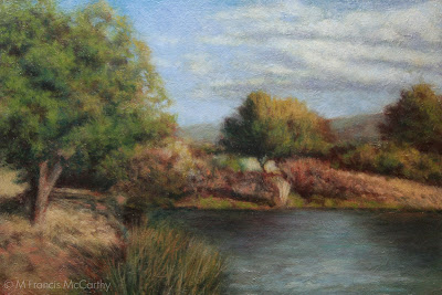
Late Summer (6x9) Pond by M Francis McCarthy

Surface quality in a painting refers to the texture and reflective quality of the paintings finish. This aspect of a painting becomes most apparent when viewing the original piece obliquely but also effects the viewers spacial reference to and appreciation of, the painting.

Many great old paintings, often done on wood or heavily gesso'ed canvas, exude an awesome character that seems to be missing from a lot of modern work. 

One reason is because many of today's painters, paint directly on top a store bought canvas's natty acrylic white pre-prepped surface. I'm not dissing them but I am saying that you get back what you put out. A cheap start will lead to a cheap finish, or it can.


I feel that every stage of the painting should be done with love and care. Starting from using a properly prepared board or canvas. Here above are the Kauri Boards that I'm using for my current series. They are 100% lovely Kauri Marine plywood:

Marine plywood is manufactured from durable face and core veneers, with few defects so it performs longer in humid and wet conditions and resists delaminating and fungal attack. Its construction is such that it can be used in environments where it is exposed to moisture for long periods. Each wood veneer will be from durable tropical hardwoods, have negligible core gap, limiting the chance of trapping water in the plywood and hence providing a solid and stable glue bond. It uses an exterior Water and Boil Proof (WBP) glue similar to most exterior plywoods.

Marine plywood is frequently used in the construction of docks and boats. It is much more expensive than standard plywood: the cost for a typical 4-foot by 8-foot 1/2-inch thick board is roughly $75 to $100 U.S. or around $2.5 per square foot, which is about three times as expensive as standard plywood.


I prep my boards with two to three coats of sanding sealer and sand them in between. As stated, marine ply costs three times more than the cheap stuff  but you can feel the quality when your painting on it vs pine or another cheaper product. 

BTW pine can be nice for smaller paintings. I prefer when painting small to use a textured surface anyway. I create the texture for my 5x5's and 5x7's using clear acrylic gesso, paper and the side of a brush to create a nice uniform yet varied surface texture that will grab paint off of my brush.

For my more finished paintings I like to utilize the wood texture inherent in my substrate and also create more texture with my brush strokes. I work quiet thin so sometimes the paintings surface is only perturbed slightly form the flat wood grain. 

A trail is left by the all work that went into the painting and the paintings surface tells that tale. Eloquently I hope, if not ant least the attempt was made and attention was paid.


Wednesday, January 23, 2013

Landscape Painting Thoughts

Lately I've gotten around to sorting through years of photos of paintings in progress, reference pics and photos of failed attempts as well. What a ton of work it's been!

That work is going into a major update to my website landscapepainter.co.nz. I've tried a few online web services but I've settled on Ezgenerator. It's template driven but very flexible in it's own way. Can't say I enjoy doing the web work but needs must.

It will pay off for this blog too as I've discovered many litle forgotten gems that I'll be sharing as we progress along here at blog central.


M Francis McCarthy with a painting by George Inness

Me and my hero's work at the de Young museum in San Francisco, California. They have a nice wing of great American Landscape Painting that was a big influence on me after I saw the original works on display there.

Pond Reflections 6x8 by M Francis McCarthy

I started painting in a Impressionist vein. "Pond Reflections" reflects this style. As I've said before, I believe that many landscape painters are working in an Impressionist manner whether they are aware of it or not.

I know I was in the period I painted this. This painting was done with a super limited pallet of Cad Yellow, Alizarin Crimson, Ultramarine Blue and Titanium white. I was influenced in that color pallet by Kevin Macpherson who has written a few great books on Painting: Landscape Painting Inside & Out  and Fill Your Oil Paintings with Light & Color. I recommend both of these books highly.

Hey, if your a real serious M Francisophile you can check out my first long abandoned blog The Rebel Artist. I keep it up just for fun. It documents a pretty good chunk of my early painting progression and I still like a lot of those paintings and will probably revisit a few of the motifs before I'm done landscape painting.

Cheers.


Tuesday, January 22, 2013

Inspiration - Past, Present, Future

Every artist must face their own best work. Whether their previous artistic highs inspire or torment them is one of the greatest factors in determining their success as artists. I have seen many friends and even other professional artists hit this particular block.

As for me, I am always aware of my previous work and I like to keep the best of it around to contemplate and appreciate. That said, I try to wear my work lightly. Ultimately I feel that good art is an expression of not just the artist alone, but of the Universe itself. 

When one recons with the effort and different elements that must go into even a bad work of art, the mind boggles at the complexity of creating a high, artistic achievement.

By the Brook  (12x18) by M Francis McCarthy

I've written in the past about artistic blocks. The best way to eliminate blocks is to keep your breaks from creating art, brief. In other words, you should be making art all the time. Inspiration does show up for those that are actively pursuing their vision as an artist.

There is many a talented artist that is unable to produce consistently high quality work. For the most part these poor folks are laboring under a certain type of belief in "inspiration". Their belief? That inspiration always strikes the artist like a bolt from the heavens, compelling them to rise off their bottoms to engage with their waiting easels and finally create that masterpiece.

Sure, we've all had an experience similar to the example above. The truth is that those sort of inspired moments happen most frequently in the early part of our artistic journey. As an artist progresses and creates a body of work, they taper off. What replaces these "lightning strikes" as the artist matures?

By the Brook  (5x7) by M Francis McCarthy

The answer for me is that I see inspiration as a collaboration between myself and the Universe. I have a desire to create beauty and I conspire with the universe to do so. I feel a "flow" well up from within. This feels natural like breathing. Creation should feel like that. Like a natural occurrence, like eating or breathing. Something you can do, something you must do

Ideally, just like breathing you let your work come and go, ebb and flow, unselfconsciously. Expressing easily and naturally in the moment. 

In closing, look at and learn from your best work and also the best work of other artists that may be doing things that you admire. 

However, always keep your reflections positive. Fear and art are a bad combination. Nature favors the brave. 

So, be present with the art you're doing now and make art a flow in your life, not a stop, start and struggle. I've more to say on this topic in future posts. Enough philosophical rambling for one day.

Sunday, January 20, 2013

Landscape Painting - Revisting a Theme

This painting was done back in 2009. I've recently revisited the theme again in a larger format with a different feel.

Creek Reflections (6x9) by M Francis McCarthy

I'm fond of this older 6x9 painting. It was painted on a maple panel that I textured with gesso. I was freshly under the spell of Tonalism and this panting reflects that. It has been painted with thousands of tiny strokes and is very diffused. It took me awhile to develop my brushwork so that is is diffuse yet articulated.


Creek Reflections (8x12) by M Francis McCarthy

When seen reduced like this the newer "Creek Reflection" seems as diffuse as his smaller brother. Here's a detail.


Is it better? Just different really, both are nice paintings. I prefer the brushwork in the newer image though because it has character while still being somewhat diffuse. 

Re the color shift between the two versions, that's more a function of my Tonalist re-expression of the theme. 
I decided that for this painting that I wanted to eliminate blue from my pallet and used black as a blue substitute. 

While this may seem odd to modern artistic intentions, artists prior to the late 1800's had scant access to blue pigments. It wasn't until the invention and marketing to artists of synthetic ultramarine blue that artists could really use blue as we do today. 

Prior to this, natural blue pigments were very expensive and hard to grind. As a result many artists used black as a blue. It actually works well as lead white and ivory black make a cool grey. 

I enjoy painting the same subjects more than once. I will usually investigate a new avenue rather than a direct copy. Copying a smaller piece up to a lager size can be rewarding but it's not as fun or artistic. 

This touches on another topic though which I've been thinking of writing about. That is how we as artists perceive our work and ourselves in comparison to past work and accomplishments. A philosophical topic I'll get into tomorrow...


Saturday, January 19, 2013

Illustration - Limited Pallets

Prior to my time working at Jack Nightingale Artworks I had done a lot of Black and white representational art and I'd also done a good amount of colorful abstracts using Photoshop  What I had not done a lot of was colored illustration.

The majority of the designs we did at Jack's we're for tee shirts. Lot's of Screen printers have 14 color machines, however many of the jobs we did were smaller runs with local printers. Most of these printers had 8 color machines. So, for many, many years I had to do complex illustrated designs with a very limited pallet.


Cougar by M Francis McCarthy

Today's illustration "Cougar" is a good example of a limited pallet image. His colors are: Black, brown, orange, tan,cool grey, warm grey, white. The astute reader might notice that makes seven colors. 

Often the eighth color had to be reserved for a white flash plate in case the design needs to be to be printed on dark colors. It was always a good idea to keep this in reserve as buyers tended to change things and without a bit of leeway the design could be radically altered by a color being taken away. Also other colors might be required by other elements in the design like type for example.

I now have unlimited colors at my disposal to paint with but my many years of working with restricted pallets have served me well. I always consider the tonal pallet for each painting that will be most harmonious. Too many colors thrown at the viewer creates disunity. That said it's so awesome to free of the eight color straight jacket that I worked under for so long. 

Obligatory Disclaimer - This image was created for Jack Nightingale Artworks and they own the copyright. I show it here for review and portfolio purposes only. Cheers.

Friday, January 18, 2013

Drawing - Measuring

Drawing is measuring and make no mistake it can be learned by anyone why applies themselves with a bit of disciplined effort. To draw anything you must relate one shape in an image to the next and the next and so on. The best way to learn how to do this is just by practicing and checking your work with a critical eye.

If your shapes are in the right place, detail is unnecessary to convey a good idea of what is being rendered. Conversely if your drawing's proportions/measurements are off no amount of detailed rendering will save your image. 


Wendy O by M Francis McCarthy

Correct drawing is still a challenge for me after 47 years of practice. Being self taught, I have some bad habits that are deeply ingrained. I have developed ways of compensating though  One good one is to hold the drawing up to a light and look at it from behind. Another good idea I use all the time is to turn my drawing upside down and look at it critically that way.

I highly recommend blocking in your big shapes and double checking the measurements before you do any serious rendering. I'm really speaking from experience here as I've been guilty of not following this advise and sometimes end up wishing I'd measured twice and rendered once.

A great way to train your eye is to do lots of quick sketches directly with pen on paper. This gets you to focus because you know you cannot erase. 

I've mentioned developing a critical eye a few times in this post. This has got to be the most important part of drawing well. At each juncture of your drawing you should be measuring, correcting and critiquing your work. Not in a way that's harsh with yourself but in a way that's honest and pulls no punches. This is the best way to improve and get ever better.

Today I'm putting up a drawing from 1985 of the now dearly departed Wendy O Williams. Can't say I ever dug Wendy's music but she was definitely a sexy rock and roll icon.

My main recollection now of doing this drawing was that it was done quite large on a nice piece of illustration board. I remember drawing this in my first solo apartment. It was done with pencil, a lead holder as I recall. Those were great for getting a super fine point. 

Obligatory Disclaimer - This drawing was drawn strictly for fun and I show it here for review and portfolio purposes only.


Thursday, January 17, 2013

landscape Painting - Liquin

I love Liquin. There I said it. 

This is from the Windsor Newton site: 

Liquin is a general purpose semi gloss medium which speeds drying, improves flow and reduces brush stroke retention. It halves the drying time of conventional oil color (touch dry in 1-6 days depending on color & film thickness) and resists yellowing.

Dawn Breaks (8x12) by M Francis McCarthy

Liquin cuts your drying time way, way down and if you use lead white (as I do) paintings are dry to the touch the next day if painted thinly. I usually dunk my brush in it before dipping into any colors. I also periodically add it to my mixes as I'm painting.

I've used straight up linseed oil as a medium in the past and it's slow drying. Many artists use quick drying mediums like sun thickened walnut oil or Gamblin Galkyd medium. I've tried the Galkyd and found it too glossy for my taste. 

I love the satin finish of Liquin and after I discovered it I never looked back.


Many oil painters like to get into medium composition debates like it somehow enhances one's talent. A good artist can create good work with the barest minimum of materials. I utilize Liquin in my painting to the fullest extent possible and I'd miss is badly if I had to make do without it.

BTW Liquin isn't cheap but it's worth the cost. Don't buy more than you think you'll use in a six month period. It has a limited shelf life. Also, they've now changed over to a nasty plastic bottle. I decant mine from a big bottle into the smaller original glass bottle and it's never far from my pallet.

Today's painting "Dawn Breaks" was painted soon after my move to New Zealand.. At the time I painted it I was feeling pretty challenged. I'd still not completely got my technique and materials to conform to my inner vision. 

Dawn Breaks was painted on a pine panel. I don't usually care for pine as a surface because it's too flat with not much grain. In this case, the board was textured with gesso before painting. 

I'd experimented with textured boards a lot while painting in California but ultimately I prefer to use textured boards only for my 5x7 oil sketches and hardwoods like Kauri for the larger pieces. I'm actually pretty fond of this painting now and it is housed in the M Francis McCarthy Foundation for the Arts permanent collection.

Wednesday, January 16, 2013

Landscape Painting - Brush Technique 2

Yesterday, I talked a bit about brush technique. Today I'd like to go a bit further. 

The brush is my preferred way of applying paint to my panels. I also use a pallet knife, but I use the pallet knife in a subtractive way. Mostly to scrape away surface dimples or sometimes to scratch away paint or even to blend passages.

Seldom do I apply paint directly with a knife. Many painters that I consider personal teachers such as Richard Schmid or Bob Rohm do paint with the knife. They both use it very well as do some other landscape painters out there.

Morning Glow by M Francis McCarthy

I guess my biggest issue with pallet knife painting is that it can so easily feel contrived. Students of painting should give it a try though as it can be perfected as a painting implement. It's best used in moderation should you care to use it at all. If you're older like me you will recall the awful overdone impasto paintings that we're so common in the sixties and seventies.

When you're painting you have a nearly infinite number of approaches to your brush handling. You can go with chiseled strokes that are long or short. Or, completely blend out all indication of separate marks.

I like to show a bit of the strokes but I also like my strokes to interweave like a lattice. Diffusion is always an important aspect of my paintings but diffusion that breaks into contrasting edges here and there.

Morning Glow Detail

Here's a detail of Morning Glow that illustrates what I mean. I aim for my brush work to be expressive while also getting the image across.  A good way to look at the brushwork in a painting is that it should look great from afar but also pay off for the viewer that gets up really close. I try to make my marks with character and sensitivity without being overly direct or contrived.

Another good tip I have for aspiring painters is to change-up how they are holding their brush. I like to use every angle of my brushes whether the edge, flat or especially the side. 

I apply paint fairly thinly building up my paint in layers of successive brush strokes. I try to always leave a bit of life in the painting. By that I mean I try not to choke out the layers that went before. I leave a bit of them showing.

When my paintings are most successful in my view they are articulated with an economy of strokes. Many times I will have to apply multiple layers of smaller strokes to a painting to get my desired vision across but it's magical when I can do it in one pass of color over my initial under-painting/drawing.

Monday, January 14, 2013

Landscape Painting - Brush Technique

Everything I write and teach on this blog is strictly my opinion. I hope that it is evident by the blog's title "M Francis McCarthy" but just for the record. Everything I write here is just my opinion. Other professional artists may have contradictory advice that works for them. I can only speak and teach from my own experience.

I'm no fan of precious, over detailed brush strokes in landscape paintings. There is a landscape painting show currently running in my town by a decent painter. While her color and composition are good, I feel she's only decent because of her tendency to use lots of tiny strokes made with a small round brush. This to me is a sure sign of a beginning or amateur painter.


A Welcome Friend by M Francis McCarthy

I was once guilty of making the same error but after constant reappraisal of the work I was doing I gradually ceased using those tiny brushes. I think it's far better to imply detail with glancing indicative strokes rather than try to impersonate a camera with a dinky little brush. Every stroke needs to have it's own beauty and also serve to build a whole image at the same time

This piece "A Welcome Friend  is a good example of my technique. There are many small strokes. In fact maybe more than I would have preferred. My approach to painting is to always use a slightly larger brush than is comfortable to execute a given passage. This is one way to combat tiny brush syndrome. 

Another way is to paint with your glasses off so you concentrate on the overall more than the specific. Note: if you have great vision you can semi close your eyes so that your vision becomes blurred and periodicity paint that way for the same result.

With a larger brush, the painter is forced to produce bolder, more painterly strokes. This is a good thing. The smallest brush I ever use even for my 5x7s is a #2 flat and more often than not I use that only for certain shadow passages. 

Brush technique is a vast topic and I'm going to touch on it again in a future post. For now though just remember to use the biggest brush you possibly can. Your work will benefit immensely, immediately.


Sunday, January 13, 2013

Dinosaurs

I executed a lot of dinosaurs while I was at Jack Nightingale Artworks. Most of them in collaboration with the other illustrator there who I'll call Rico out of respect for his privacy. Rico was a good artist and we we're buds for most of the time we worked together. We both worked on the dinos, passing them back and forth in an effort to make them better and better. 

Quite often we'd base our dinosaurs on reference from Jacks extensive morgue files and later on we'd use images from good ol' Google. Unlike animal illustrations that you can find photo reference for, dino photos we're not available. There we're no cameras back when they ruled the earth.


Rico did the preliminary sketch for these dinos and I did all the rendering. Every year we'd have to try and top the last. We'd add features like scales that were printed in puff ink or we'd do special glow in the dark plates. 

These guys pictured here we're done near the end of the dino days at Jack's. The new technique that was added to them was the reflected highlights. White on one side and taupe on the other in this case.


Doing dinos every year was fun for a while. I must say though that the printing of our designs often fell way short of the comps we produced. The reps that worked the dino account would often make "creative" contributions to the designs before the actually got printed. The additions or subtractions could be nightmarishly bad. 

Another case of non artists expressing themselves at the expense of the artwork and the final product. I cannot say I miss viewing some of the train wreck tees produced from our painstaking renderings.

As a side note, these illustrations are copyrighted by Jack Nightingale Artworks and I show them strictly for review and portfolio purposes. BTW Jack didn't draw any dinos. He had a pretty good gig for many years adding type and background squiggles to the designs while taking credit and getting paid for the entire enterprise. Rico and I got a paycheck. 

Hopefully, Jack is still receiving income from these dinos as I have seen reworked versions used on items like swim trunks and tees as recently as last year. 

Friday, January 11, 2013

Inspiration

I enjoy talking with the many artists that visit my studio at the Quarry Arts Center here in Whangarei. Today I was chatting with someone about Inspiration. Actually the topic of artist blocks came up but I prefer to couch this phenomenon in the positive context of Inspiration vs the negative attribute of "artists block".

There are many causes of artists block. Here's list off the top of my head:
  • Not enough work being created
  • Not enough time spent doing art
  • Too much comparison with past work or the work of others
  • Lack of desire to create art
  • A bad attitude about one's art or abilities
There's probably a lot more causes I'm not thinking of but this list gets the ball rolling. I'd say the worst on the list is having a bad attitude. Without the proper attitude nothing of any consequence can occur.

California Hills (6x9) by M Francis McCarthy

Now lets start reworking the bad attitude by rewording "artists block" to "seeking inspiration". One simple change like that can completely re-frame the issue. There is a lot more positive changes that can and will eliminate any artists block.

Here's some great ways to find inspiration:

  • Work more, talk less. Inspiration shows up for those who are working and avoids those who prefer talking about working or work they've done in the past.
  • Pick a style and master it before moving on. This is all about focus which I'll talk more about in a future post.
  • Emulate the work of artists you admire. By this I mean teach yourself whats good about their work that touches you as an artist. I am not saying that you should ever try to assume the style and working methods of another artist as your own. What I am saying is that the best way to learn how to do something is to try to recreate that which moves you.
  • Give yourself a break. If you're truly working hard at your art, your stuff cannot stay bad for long. Hard work always pays off. Always. So don't be too self critical while you're developing as an artist. That's not to say you shouldn't be critical of your work. You should be creating enough of a flow of art that no one piece is all that important anyway.
  • Destroy you worst work. You don't need it around if it sucks. If you are really working as hard as you should be, you'd have so much art sitting around that you won't mind getting rid of the crap.
  • Do more pieces that take less time. If you have to, work smaller. Smaller works take less time generally speaking and this allows you to cover more ground while mastering your craft. 
I could keep going but that's enough to get you started.

A bit about today's painting California Hills. I painted this back in 2009. It's maybe my third or forth painting in a Tonalist vein. 

I was working on textured panels at the time and I still do my 5x7s oil sketches on textured boards. These days I prefer to do my final paintings on a regular wood surface. The type of wood does matter and I really like hard woods. Here in New Zealand I use kauri which has a nice tight even wood grain.

Drawings 3

This image was illustrated by me for a company I worked for in the eighties and nineties I will call Jab Art Enterprises. I worked for a guy I'll call Jude. I started there in 1984 and worked for Jude till 1997. For a long while I thought I would never be able to leave that job. More on that in some other post, some another time.

Cypress Point by M Francis McCarthy

Jude marketed this drawing and others to places like Montgomery Wards and J. C. Penney as part of a "California"series. The ink drawings were photocopied and then hand water colored. The Series featured points of interest in California  

At Jab Art Enterprises we primarily did contract framing on a large scale. We also produced "graphics" for the hospitality industry. At the time I drew this we we're more into department stores. I'm not sure if any of them bought this. 

The painter in me was coming out for the first time back then. You can see it for example in the way I knocked out the highlights from the cypress tree with white paint. 

At that time I was taking painting lessons from Smitty, a customer of Jab Art Enterprises. Smitty taught oil painting to stressed out corporate types as a regular gig. He had a few companies that he would set up in after hours and their employees would come and learn how to paint. Smitty provided everything that was needed including frames that he purchased from Jab Art.

He practiced a form of the Bob Ross style, quick landscape painting that was easy to learn. For my part I always preferred to use actual landscape photos rather than copy the formula paintings from a book that Smitty provided as reference for his students.

I owe Smitty a lot as he not only taught me for free but he also provided the art materials and picked me up for class. A wonderful man I'll always remember with gratitude. He is one of the reasons I write this blog and share what I've learned about art freely.

Cheers, Smitty wherever you are now.

Thursday, January 10, 2013

Old Drawings 2

Putting up a an old drawings today. For years all I did was draw stuff in pencil and pen and ink. As I've stated in the past I believe good drawing to be the one irreplaceable element of any decent representational painting.

In this era of extreme photo manipulation, drawing could seem passe or even unnecessary. Ultimately those who can draw will produce stronger designs, illustrations or paintings. While those who cannot will spend a lot of their time finding ways around their lack of skill in this area.


Robert Fripp by M Francis McCarthy

This is a pencil drawing of Robert Fripp, illustrated circa 1985.The drawing exhibits a hatching technique I had devised of alternating horizontal and vertical cross hatches or "jits" as I some times refer to them.

I think that style is super important to young artists but as you get older becomes much more an internalized part of how you draw. I definitely appropriated quite a lot of technique from my illustration heroes. People like Bernie Wrightson  Neal Adams and John Byrne influenced me tremendously. Not to mention the king of them all Frank Frazetta.

The photo reference for this was a nice image already. Music and other popular magazines were a favorite source of drawing reference for me. My philosophy about drawing people at the time was to draw every type of person. I would often go though issues of TV guide and draw the various differnt people pictured in an effort to improve my drawing.


Wednesday, January 9, 2013

Illustration - Hired gun

Let's go back in time to Jack Nightingale Artworks in 2000. Actually a really great time for me there. Jack Nightingale Artworks was a division of a company I will call Sales Today. Sales Today mostly sold tee shirts. 

All the art was done by myself and the other artists at Jack Nightingale Artworks. While the actual printing was contracted out to local screen printers. In 2000 things were doing well there. We were selling lots of tees at the national parks, the San Diego Zoo and also money was flowing in from our newest account Starbucks.

I had started as art director after my friend David had left the position to work in New York and I was busy but nowhere near the crushing kind of busy that was in my future. I'd recently bought a home and life was good. I was happy to be making a good living as an artist and I'm still thankful to the universe for granting my desire.

I was however a hired gun. In 2000 I was pretty content to just be that hired gun and shoot the hell out of whatever came up. I really put all my creativity and passion into my work and I always endeavored to make each illustration the best I was able.


This bison was done for a Yellowstone tee shirt design. Yellowstone was a frustrating account as they always bought only a few designs but we did tons of art for those few. 

This guy was never actually used in this format on a tee but was recycled for many designs over the years. I am proud of the hand stippling on this bison. I used to love to stipple the different colors on animal designs because it always printed well.


I'm happy with this dragonfly. I created it at my home studio. It was printed on a tee for The Nature Company. A now defunct chain of stores that sold scientific stuff, Cd's and Tees. I was so happy they choose it but unfortunately it was printed super tiny on the tee shirts. 

A "creative" decision made by the buyer. Many buyers loved to put their stamp on others work. My theory is that many of them were frustrated artists. That said I've known some awesome buyers that were a joy to work with.


These cats represented a break through for me at Jack Nightingale Artworks back in 1998. The cats were never used with these colors on a tee. I did these illustrations while Jack was on a golfing trip in Hawaii. Something he did often in those days when Sales Today's business was good. 

I had only been at Jacks for about 5 months and was still getting used to the compromises a professional hired gun has to put up with. By this I mean my art getting changed and quite often just so Jack could put his stamp on it.

He came back from his trip and loved my cats but decided to have me rework them in muted grays and tonal browns. The end result looked pretty good and sold great but I still feel these brighter cats have more appeal. Being the hired help though I could only cooperate in the dilution of my originally stronger idea. 

Making a living with your art is great but it comes with a cost. Sometimes the cost is minimal, other times it's devastation to one's core passion as an artist. If this price is paid to frequently an artist runs the risk of losing their creative spark altogether. Like a horse thats been rode too hard for too long.

Tuesday, January 8, 2013

Landscape - Tone

Tonight I thought it would be nice to expand upon tone. I like the word tone as is is a open word with interesting connotations. Quite an ambiguous term when you ponder it, as we are going to now.

I use Tone to mean resonance/value. Also implied in the word tone is color harmony. I will often tilt the colors in a painting towards a unified tone. Yellows of all stripes are a favorite but I will use just about any hue as a unifying tone with the general exception of green as greens are such a present color already in most landscapes.

Tranquil Field (11x15) by M Francis McCarthy

The unifying hue here in "Tranquil Field" is a warm yellow tone. There is also a strong resonance of sienna from the paintings foundation. If you read yesterdays post about Tonalist limitation of values, you can see that the whitest parts of the clouds are far short of an actual white.

The lightest parts of a painting reveal it's unifying tone the most because it's harder to perceive color in shadow areas. The dark's can definitely be tilted towards warm or cool in any painting though.

There are times that I will glaze a very light wash of color over an entire painting but more often I set up my colors in advance to harmonize. Glazing an entire painting tends to darken it and you've got to be really restrained if you try it or there's a good chance of ruining your painting.


Tranquil Field (5x7) by M Francis McCarthy

Here's the oil sketch for "Tranquil Field". I've been posting my oil sketches with there larger brothers regularly because I feel it's illuminating. Also, I like to give my little paintings some attention. There have been times that I liked my small 5x7 better than it's larger brother but usually I think they're both good for different reasons.

My approach to the small paintings is very direct and immediate. At the same time I'm looking towards the harmonies that will resonate through the larger version of the scene. 

Today's picture "Tranquil Field" can currently be viewed in my studio at the Quarry arts center, Whangarei.


Sunday, January 6, 2013

Using just some of the notes...

A gentleman came into my studio today and we we're discussing painting and art in general. He remarked that he liked my work and that it had a pleasant "old time" feel.

I responded that my art was greatly influenced by a painting movement called Tonalism. Tonalism ran concurrent with Impressionism and was popular from the late 1800's to early 20th century. I believe most landscape painters these days to be of an impressionist bent whether they are aware of it or not.


Country Road (12x12) by M Francis McCarthy


One distinction between the two styles is that Tonalism uses fewer notes than impressionism. By that I mean that if you look at the value scale here below:


You see the entire range of values from white to black as 10 divisions. You could also see these as notes, like piano keys on a piano. 

Many paintings done in an impressionist way utilize the entire value scale from brightest to darkest values. A Tonalist approach usually holds way back. In my paintings I generally eliminate the brightest values from the ten step scale. and I often use even less of the available values. 

This is what I mean by "using just some of the notes". The benefit in doing this is a more cohesive and harmonic painting that creates a unified "tone". There are drawbacks too, and the greatest one is creating paintings that are too dark for brighter spaces. The benefit though is a greater conveyance of feeling and a generally more meditative quality


Country Road (5x5) by M Francis McCarthy

Today's picture "Country Road" is good example of the ideas in today's post. The 12x12 can be viewed at my studio at the Quarry arts centre in Whangarei. the 5x5 oil sketch is in a private collection now.